It’s high time that I posted a nifty site to inspire all of you, so here you go:
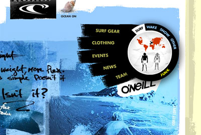
Truly a unique method of handling site navigation. What do y’all think?
It’s high time that I posted a nifty site to inspire all of you, so here you go:
Truly a unique method of handling site navigation. What do y’all think?
6 responses to “Nifty Site Navigation (O’Neill)”
Wow, that’s a really cool site!
i love this site. i love how all the elements and navigation relate to the brand and are just plain fun to use. it’s also impressive that 2advanced went away from their usual ‘tech’ style and did something very craft oriented. nice stuff!
It’s way cool, but it looks like it would take at least three minutes to load over dialup.
Also, the triple-split nav is confusing; if nothing else, the differences between “products,” “clothing,” “surf,” etc., is less than obvious.
Hey Mark, that’s a great comment about dial up. Seriously, I know a few people who still use dial up and they’d never wait for a site like this.
But I wonder if that’s a good enough excuse to not do a site this awesome? Who knows.
I agree about the split up navigation. That part must not have been thought through very well.
I think the biggest thing that you have to take into consideration when creating a site like this is your target market.
Most people who are into surfing and snowboarding and what not are young people who don’t tolerate dial-up connections. Honestly, just about the only people I know these days who don’t have access to some sort of high speed connection are either elderly people or people who just want to check their email every now and then.
Dunno though. I could just be presuming too much.
Have to correct myself, 2A did not do this site. Don’t know why I thought that…this guy did it: http://www.moosesyrup.com/