Here’s a screenshot I took in 2001 of The Apple Store.
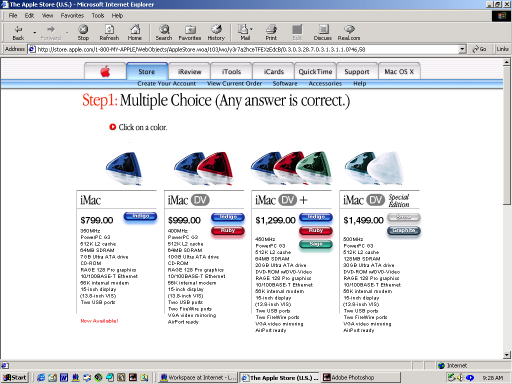
And here’s what it looks like today.
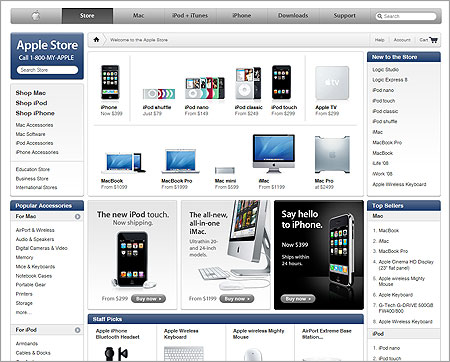
A lot has changed, and then, not much has changed.
Here’s a screenshot I took in 2001 of The Apple Store.
And here’s what it looks like today.
A lot has changed, and then, not much has changed.
8 responses to “Blast from the Past: The Apple Store Online”
THey use Ajax on their current site now, don’t they? Always admired them for their simplistic and elegant approach to ALMOST everything they do.
Had you taken that screenshot a few months ago it was have been much more similar since they just recently replaced those buttons.
Oh Apple, how I adore you and all your fruitful ways. I love you *so much*, Apple.
Apple used to be Brand driven by Product and Communication.
Today, Products take over and Communication becomes more commercial.
Especially from the web.
Glad I am not the only one who sees the new design as a downgrade. I know the liquid tabs were copied everywhere but that was for good reason. The new navigation bar is plain ugly, the Apple Store image looks amateur and overall it looks like an OSCommerce template. And that is ignoring the excessive quicktime movies which take ages to load and actually crash Firefox.
Sorry for the spleen venting but their design is usually so good, I couldn’t believe they would take a step back.
How much ya wanna bet those are warezed versions of Photoshop and Illustrator 😀
Those are/were legit.
Here from Veerle. @Brian, wow – seriously? I hated those aqua tabs so much my teeth hurt. I don’t mind Aqua in Tiger, but those horrible tabs on their website were awful. The text was hard to read in the glossy submenu beneath the tabs. I much prefer the new navigation.
I do see the reference to oscommerce, which I generally hate, but that’s a popular ecommerce design because it works well. At least Apple’s isn’t full of tables 😉