Ha! they didn’t try hard enough because it falls to pieces in Camino for Mac OSX. The CSS is stripped!
Their emphasis of the “social” aspect with huge photos of people on every page is a bit much.
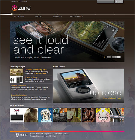
My only design comments are that
a) The fiber optic-like menu lends itself well to a linear tour but poorly to actual browsing of the site
b) Hover effects for image links aren’t consistent, some change, some don’t, some don’t look like links.
But, it’s a good match for Microsoft’s new Live/Vista style. It’s not a bad design, and I’ve always been a sucker for rich colors and glass effects.
Nice site design, I like it. The navigation may look like a tour but it also meant to mimick the timelime(or whatever you call the line that shows you where you are on a song) on the actual player itself. When the product does launch I think they really should make it a more direct force-fed retail site. With clearer product specifications and full-on ecommerce.
I don’t like the design. I think it’s a rip-off. Looks a lot like Urge. http://www.urge.com/
I don’t like the design. I think it’s a rip-off. Looks a lot like Urge. http://www.urge.com/
Nope looks nothing like it
Wow then I guess you think any site with a large header and dark colored layout are the same. It isn’t a ripoff.
6 responses to “Zune”
Ha! they didn’t try hard enough because it falls to pieces in Camino for Mac OSX. The CSS is stripped!
Their emphasis of the “social” aspect with huge photos of people on every page is a bit much.
My only design comments are that
a) The fiber optic-like menu lends itself well to a linear tour but poorly to actual browsing of the site
b) Hover effects for image links aren’t consistent, some change, some don’t, some don’t look like links.
But, it’s a good match for Microsoft’s new Live/Vista style. It’s not a bad design, and I’ve always been a sucker for rich colors and glass effects.
Nice site design, I like it. The navigation may look like a tour but it also meant to mimick the timelime(or whatever you call the line that shows you where you are on a song) on the actual player itself. When the product does launch I think they really should make it a more direct force-fed retail site. With clearer product specifications and full-on ecommerce.
I don’t like the design. I think it’s a rip-off. Looks a lot like Urge.
http://www.urge.com/
I don’t like the design. I think it’s a rip-off. Looks a lot like Urge. http://www.urge.com/
Nope looks nothing like it
Wow then I guess you think any site with a large header and dark colored layout are the same. It isn’t a ripoff.