The White House web site was redesigned recently, and the new site looks more like a step backwards than a step forward, in my opinion. What happened? It’s like Web 2.0 White House.
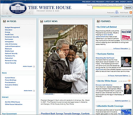
The White House web site was redesigned recently, and the new site looks more like a step backwards than a step forward, in my opinion. What happened? It’s like Web 2.0 White House.
13 responses to “White House Redesigns”
what did the old one look like? did anyone ever go there?
http://web.archive.org/web/*/http://www.whitehouse.gov
is that a massive amount of tables i see in there???
I like the colors:D
I’m actually really surprised at their choice of font size. Considering the massive demographic it has to reach (from youth to senior citizens), you’d think they’d pick a type size that was so small that even I had to get close to see it.
I like it. I think.
I’m Canadian so I really can’t comment on whether not it’s a step forward or back having not seen the previous version. What I can tell you is that it is very refreshing given that our Governments look and feel standards are extremely archaic. Our Government still requires a 640×480 max resolution and websafe colours. No Flash (unless text equivalents are also included) and javascript should be used only when absolutely needed. Here is a link to a page template which will give you an idea of how restrictive it is.
http://www.tbs-sct.gc.ca/clf-nsi/6/exmpl2_e.asp
I think the layout is promising, but executed pretty badly. The colors are nice, but ya know, how do you go wrong with that palette. The font sizes are pretty sad though.
At first glance (the top of the page) it looks good. But then you notice that the margins around text blurbs are pretty much non-existant. And the code is all font and table tags! It looks like somebody pretty much does not know what CSS can do.
I dunno, looks nicer to me.
I like the site but not so much the administration lol 😉
Oh my godness, it’s pretty stuffed with tables all over.
U.S. High Tech country?
It’s clean, easily navigatable and has informative content – which are the main needs for the visiting audience. WAY too many sites are overly designed. Just because you CAN add Flash to a site, doesn’t mean you always should 😉
The text could def. be a bit large – agree with that. But the design is MUCH better than the previous – IMO