I am not sure when this site for Union Bank of California was designed however it has some nice aspects I wanted to point out.
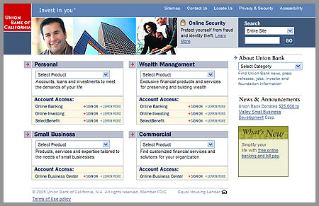
- Nice grid design with plenty of focus on logo and slogan.
- On the homepage, the four business groups are evenly represented and the section headers are links. Cool idea.
One response to “Union Bank of California”
they redesigned sometime in the last year. It’s much better than before. Pretty straightforward and usable overall IMO…