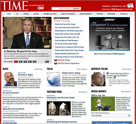
Time.com has launched a brand new re-design, and I really like what I’m seeing. They’ve created a clear layout that is surprisingly easy to navigate.
The most surprising thing of all is that the top header area (all red) doesn’t contain a single advertisement. Instead, the ads are in the content areas. That’s really nice.
Via Mark


2 responses to “Time.com Redesigns”
It’s refreshing to see a news site that isn’t uber-cluttered.
Go Time!
I’ve got to say, it’s so nice to be able to follow re-designs (and nice design discoveries) on Brainfuel. I’m pruning my RSS feeds, but Brainfuel will definitely stay on the list!!