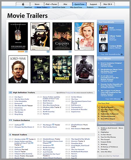
Nice article Mike, I agree with you about the spacing. It’s so much cleaner now that the posters are separated. I also like the larger font for movie names. Makes a huge difference!
Thanks, and you’re absolutely right, it’s amazing how much of a difference 1 or 2 point sizes make.
6 responses to “The Apple Trailers site Revamp”
thank goodness. this is a really nice revamp. a lso a nice way to show off the HD offerings..
Wow. Really nice design. Just one comment: TABLE LAYOUT!!!! 🙁
Much better, it is a lot easier to find things and looks pretty good also.
Hey Chris, I posted something about the new trailers site a little while ago, check it out if you’re interested.
(In case the HTML gets stripped out here is the URL http://theubergeeks.net/2005/10/14/apple-trailers/ )
Nice article Mike, I agree with you about the spacing. It’s so much cleaner now that the posters are separated. I also like the larger font for movie names. Makes a huge difference!
Thanks, and you’re absolutely right, it’s amazing how much of a difference 1 or 2 point sizes make.