I ran across Splunk this morning. I thought the design was quite nice… it’s clean, has a low color impact, and big bold headlines and cheesy tag lines. You can even refresh the page to see a different one. I like it.
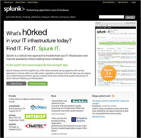
I ran across Splunk this morning. I thought the design was quite nice… it’s clean, has a low color impact, and big bold headlines and cheesy tag lines. You can even refresh the page to see a different one. I like it.
5 responses to “Splunk”
Agreed – Splunk’s design is nice, simple, usable. The random tagline generator kept me on their page for a few minutes – pretty long when you think about it. I like their “Take the SH out of IT” slogan – good stuff.
Nice website, clean and simple. Good stuff.
Well, wouldn’t you know their website is down for maintainence now.
I bet they went “oh, I bet Kyle wants to see that sweet site, let’s take it down now!!!”
Yeah. Something like that.
That’s one really awesome maintenance sign. I wonder why they had too bring it down??
We brought it down for maintenance because we moved to a different location in the colo. More room. Sorry about that!
Thanks for stopping by, Rob. Love the site.