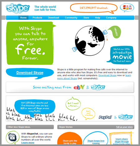
What do you think of the Skype web site?
I personally really like it. It’s fun, bright colors, good navigation system (which is easy to read, easy to use), and overall they’re not afraid to do something different. You could call it personality. What do you think?

6 responses to “Skype”
yeah love it, it doesnt follow the branding tho – i guess they were a victim of apple style logo design back in the day 🙂
mark
i think having a fun design often makes something more approachable. this is probably very important for a company like skype, since some people are still reluctant to embrace VOIP technology.
No, it doesn’t exactly follow the visual style of the logo. Is that a bad thing? It’s not like the site’s graphical treatments are inconsistant or entirely disparate from the branding, which I personally consider to be excellent. I don’t consider anything on this page to be the result of Skype having been ‘victims’. Perhaps the logo treatment was influenced by a larger trend, but it’s a good logo and continues to feel contemporary.
Yeah, I think it’s cool. Even tho’ there’s a lot going on, it doesn’t feel “busy.” It looks as if it were demographically driven – which is cool. It’s nice to see something that big colouring outside the lines.
The idea of using the comic speech bobels works fine with the product, BUT… i would find it even nicer if they had separated the “kids drawing”-style more from the skype style. e.g. by making the skype-styled items the container of the “kids drawing”-styled items, it would have kept the Skype profile intact.
And the have completly left out the mouseOver effect(exept the flash and the bottom), that enhances the usability. Not clever, when you have that many visitors on so many diffrent level of experience.
Can anyone tell me who designed the skype site? I love the animation on the home page!
thanks,
JennyAnn