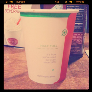
 Okay, so the other night I visited a Seattle’s Best that was inside a Borders Bookstore here in Phoenix. I ordered a small mocha and thought about their recent rebranding.
Over at Brand New, 46% in a poll agree that the new logo is a “dumb move.” Which is interesting to me, considering how much I liked it when I saw it in-person the other night. I suppose it’s the old-world charm of their old logo that people miss the most. The new branding however probably frees up their design team to explore a lot of new directions they could not have gone before.
I must say though, that their new web site is rather cool looking. The colors they chose are new and modern, and have a pastel quality. I like the interactive components, and their “coffee level” concept. That’s new, and I haven’t seen that before.
The funny thing is they’re owned by Starbucks, which also recently redid their logo.
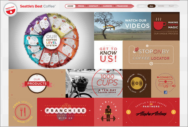
 I’d say the one thing I don’t really care for, is the rounded font they chose for their logo. And why did they rotate their logo on their web site? It’s a good logo that didn’t need to be rotated.
Other problems I see, are the curious lack of a clean URL structure for sub pages (no URLs at all, actually on most), and a frankly mysterious structure to the sub pages, apparently all designed but with little text.
According to Seattle’s Best, this is their first rebranding in 40 years.
2 responses to “Seattle’s Best”
The rotated logo adds an informal and playful element. Perhaps that’s what they were aiming for with that decision.
I like their website too, but as I was browsing it I felt a bit disconnected, and then I realized the site doesn’t have any people photos that I would normally connect with a coffee shop.
It will be interesting to see how the new branding strategy works. It certainly has remarkable differences from the Starbucks brand.
Good point about the people photos. They almost appear to be stock photos in the sense they’re never taken at an actual Seattle’s Best.