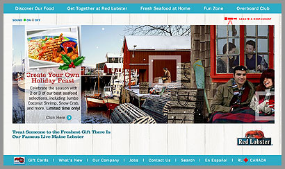
Red Lobster really has outdone itself with their web site. It’s really quite nice and has a very nice holiday feel. I wonder if they’ll keep the same style and just insert graphics for summertime or if they’ll totally revamp it.
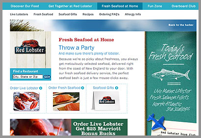
I also thought the subpages were quite nice. Somebody really put some thought into the layout with the intense purpose of creating a feeling of fun. Notice on the subpages that the grass in the photo is moving. The photos on the Beverage Menu page are awesome!
High five to the web team. It’s a winner!
One response to “Red Lobster”
Actually, the Red Lobster home page appears to be VERY similar to what it’s looked like for quite some time.
In the summer, it looked like the same little harbor… only with summer scenery (People in shorts & t-shirts, lots of sand, etc.)
However, I must agree with you… Their design team did an EXCELLENT job.