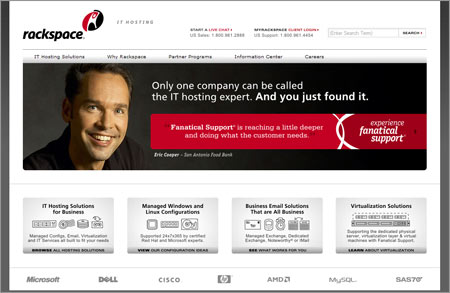
The jury is still out with me regarding the icon – but I do think that killing the color (the red “Space”) loses some of the brand equity established over the past 10 years or so.
Hmmm…
HMK
I’m on the phone with a Rackspace tech right now and he’s like, “yeah, it’s ‘fresh’” LOL
Though not that big of a change, the type seems much more modern.
The icon goes the other way for me though. It seems *very* 1998-middle-of-the-dotcom-boom to me. The previous version was simple, made sense, and doesn’t feel tied to a particular trend or style. (Well, the type does. Not the logo itself.)
Lots of hoopy, swooshy curves and a little iconic stick man almost seems like a designer playing a joke on marketing. 🙂
Agree Completely with Mister Jason and Michael.
The old identity communicated what they did – “Managed Hosting” while the new one does not. The old logo looked like a server rack so you could make out that this was a server company. The new logo looks like they stretch obese people (in the medieval definition of rack).
They should have kept the old logo and just updated the font.
The old logo also looked like an upper case R. Prediction: they keep the old icon but it takes them a week or two to figure it out.
Yeah. I’m on board with that. Wait and see.
The icons says ‘Reach for the sky!’ in a holding-you-at-gun-point sort of way…
The new logo is about people, not about servers. The old logo was about putting servers in racks.
The old logo was the equivalent of BMW having a car for their logo.
They have obviously gone through a branding exercise and come to the conclusion that there business is about the personal service they provide to their customers. Thats what makes them different, not the fact they have lots of servers.

8 responses to “Rackspace Rebrands”
The jury is still out with me regarding the icon – but I do think that killing the color (the red “Space”) loses some of the brand equity established over the past 10 years or so.
Hmmm…
HMK
I’m on the phone with a Rackspace tech right now and he’s like, “yeah, it’s ‘fresh’” LOL
Though not that big of a change, the type seems much more modern.
The icon goes the other way for me though. It seems *very* 1998-middle-of-the-dotcom-boom to me. The previous version was simple, made sense, and doesn’t feel tied to a particular trend or style. (Well, the type does. Not the logo itself.)
Lots of hoopy, swooshy curves and a little iconic stick man almost seems like a designer playing a joke on marketing. 🙂
Agree Completely with Mister Jason and Michael.
The old identity communicated what they did – “Managed Hosting” while the new one does not. The old logo looked like a server rack so you could make out that this was a server company. The new logo looks like they stretch obese people (in the medieval definition of rack).
They should have kept the old logo and just updated the font.
The old logo also looked like an upper case R. Prediction: they keep the old icon but it takes them a week or two to figure it out.
Yeah. I’m on board with that. Wait and see.
The icons says ‘Reach for the sky!’ in a holding-you-at-gun-point sort of way…
The new logo is about people, not about servers. The old logo was about putting servers in racks.
The old logo was the equivalent of BMW having a car for their logo.
They have obviously gone through a branding exercise and come to the conclusion that there business is about the personal service they provide to their customers. Thats what makes them different, not the fact they have lots of servers.
The new logo is far, far better.