I like the simple web site design on Passpack. The muted color pallet and the big buttons are nice. I also determined that the logo is Myriad Pro Semibold (and some form of condensed width and height).
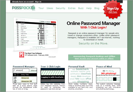
I like the simple web site design on Passpack. The muted color pallet and the big buttons are nice. I also determined that the logo is Myriad Pro Semibold (and some form of condensed width and height).
2 responses to “Passpack”
Thanks! People either love that mute green, or hate it. There seems to be no middle ground.
Cheers-
Tara
Passpack Founding Partner.
(the font is a modified Frutiger 🙂 )
Haha, I can’t believe I got the font wrong. Oh well, thanks for visiting!