The New York Times has redesigned its web site. I really like it. Clean layout, nice use of typography, plenty of spacing, and long scrolling pages (I like those).
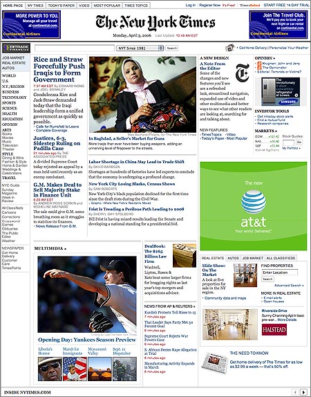
The New York Times has redesigned its web site. I really like it. Clean layout, nice use of typography, plenty of spacing, and long scrolling pages (I like those).
6 responses to “NYTimes.com Redesign”
I love it!
I like today’s news on their frontpage even better: Macs now can boot into XP with Apple’s support!
Long scrolling pages? I much prefer pagination, at least when it’s done well, like at the International Herald Tribune. You don’t have to look hard for the “next page” button, but instead the entire right column of article text functions as it!
Wow, man, that is insane. I’m really excited about that prospect.
The new NYTimes.com is better but it’s not enough. Khoi Vinh, design director at NYTimes.com, calls it “awesome.” Even more awesome is the urgent need for effective design and advertising models. Newspapers aren’t changing their sites enough or fast enough.
“This site, like so many other newspaper.coms, still makes you feel like you’re staring at a detailed database schema diagram on a whiteboard, says Jay Small, leader of Small Initiatives, a consumer experience consultancy.
See complete story and alternative designs:
http://www.brasstacksdesign.com/nyt_nytimes_online_redesign.htm
For reference, here’s another newspaper’s brand new redesign, standards-compliant: TorontoLife.com. Well done, with a different feel than the old-school feel that the NY Times is going for.
Ben – I like the Toronto Life site. That’s cool.
Alan – Good insight. I personally really like the way the NY Times site reads but I’d honestly never use it. For some reason sites like Drudge Report appeal to me more than anything. Now that would be a hard site to redesign.