The new Adobe.com harkens back to the days when Adobe was more about the creative side and less about the business side. For years now the Adobe web site has been pushing “Enterprise” and “Corporate” products. It’s nice to see them going back to their roots. Or maybe this is a Macromedia influence?
5 responses to “New Adobe Web Site”
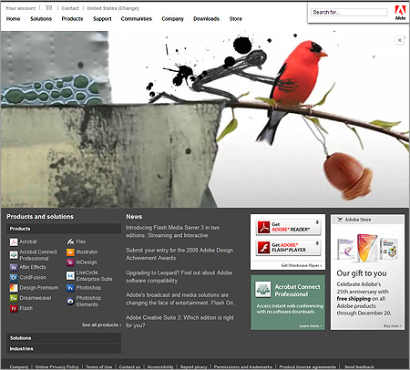
Maybe my resolution is too high, but, the Adobe logo being set to the right throws the whole thing off for me.
And where did you go to get that screen cap?
Just realized that not everyone is seeing this version.
Even on the same computer, I see the above in Safari but in Firefox I see an entirely different design!
You know, when I visited the site I thought it was awful, but your screen grab looks really nice. I think everytime you load it serves a different image, because the one I got didn’t fit the design as well as this.
When I set my window larger to the main content area it starts to get ugly, and even on my fast connection it took something like 2.5 minutes for the Flash piece to load, which in my opinion is waaaaaaaaay too long for the main content area/best real estate on your site. And I hate the persistent feedback icon, but I think that was there before.
In reference to getting a totally different design, they may be doing an A/B test on the site, you’re in A group in one browser and B in another.
Your connection isn’t very fast if it takes 2.5 mins 😛
I just hit reload and saw the cardinal that you got in the screenshot. Very cool site! It better be if it’s Adobe!