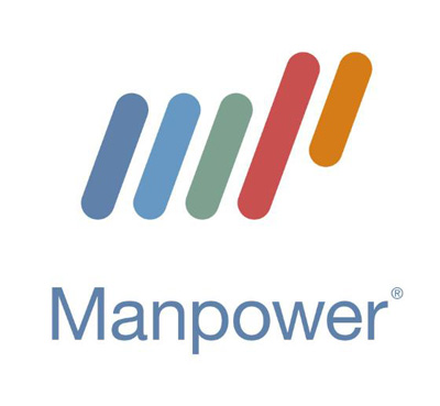
For March I’m voting for this logo as Logo of the Month. This logo belongs to a worldwide recruiting firm which is currently rebranding from a number of company names into one name — Manpower. While I do believe the icon is super simple I think it works in this case. Using but a small number of my neurons I can make out the letters ‘m’ and ‘p’ in the symbol and they stayed away from using colors with a strong hue. So that’s nice.
16 responses to “Logo of the Month #6”
Wow. So simple. And yet… so complex.
It’s definitely different, that’s for sure.
Uh-oh. It appears that there is an anomaly on the manpower site. I saw a photo of…
a woman.
*audience gasps*
Wow, that is an awesome logo. I wish I could come up with something that good for my company, KnowVox. KV just doesn’t lend itself to that sort of thing.
Chris, do you know how made the new logo?
I’m not sure. I do know that they’re a huge company (27,000 employees).
http://investor.manpower.com/ReleaseDetail.cfm?ReleaseID=188081
Get rid of the last two lines, turn it sideways, and what do you have?
Ericsson!
http://www.ericsson.com/
So much for originality.
The identity work was done by Wolf Olins and although the logo “hints” at the MP of man power this is not the aim of the logo. The company do not wish to be known as MP. The logo’s message is “multiple choices, multiple colours”.
More detailed description of the design thought can be found here…http://www.identityworks.com/reviews/2006/manpower.htm
Quote taken from that page:
“That said, I must address the logo too. Its design strategy puzzles me. The Manpower name is (although regrettably chauvinistic) a wonderful identity asset, but it’s overwhelmed here by the symbol. And to what end? Does the symbol convey a compelling idea? Not really. You might see initials, which (undermining the name) is actually counterproductive. Personally I see a wooly animal (bison?); my ancestral hunter genes, perhaps.”
Hmm… I would have to agree.
Not only that, but “Multiple choices, multiple colors” sounds like a hippy, new-age statement bordering on racism.
Geez.
I thought it was stitching that got away from someone.
Thanks for posting the review with some of the “what we meant to do” and “what happened.” I love reading those. They don’t want to be “MP” but I wonder if the logo looking like an “MP” will do it. And does that mean a new new logo?
Seems strange that what the logo suggests to so many is the message the company DOES NOT want to portray?!?!
Think you may have a point Jessica, time for a new rebrand of the new rebrand perhaps?
Hi, I am the designer of the above Manpower logo. I was a freelancer at Wolff Olins. Thanks for all your comments. You can see initial ideas for the logo on my website. Any questions just ask.
Alex Griffin
Alex what’s your web site would love to see your stuff
Thanks for posting the review with some of the “what we meant to do” and “what happened.”
Everytime I’ve seen this logo from the freeway (1-15) I say to myself how much I like it. I finally did a search to see if I could find who did it. Great work Alex!
pretty shemale videos man fucks shemale free shemale download free shemale sex sites shemale storie free shemales pic dates
http://shemalefree-online.blogspot.com/
how to make ahome made dildo blonde big tits orgasm free indian porn incest horny women with dildos milf movies stars huge tits movie http://bigtitsfatass.blogspot.com/