I was going to skip this month since I hadn’t seen any good logos and then I had a discussion with someone who works at Fender Guitars and decided it was worth telling their story here on BrainFuel.

Fender Guitars is based right here in Scottsdale, AZ and is celebrating 60 years at the moment. They have a ton of sub brands and manage them all very well. Something you might not be aware of however is that there are many variations to the Fender logo. I’ve shown the main one above which they use now. For years they used a different one (see below) and they still do today! It’s really a great story of a company throwing all of the common branding principals out the door. While they are careful about their brand and meticulous when it comes to using the proper identity, they also use a slightly different logo depending on what era the product was made in (several projects have been in continuous production for 50 years). So they basically have products on the production line with several different variations of the Fender logo. Very cool!
After talking with this guy for over an hour I came to the realization that this company treats the brand with respect but they also realize it’s all about the product. So they’re quite casual about how they run their creative department.
Then I dug a little deeper into the whole guitar industry and realized it’s big and deep! Quite a bit of history goes into this industry and as a result all of the companies have older brands (50 to 100 years old).
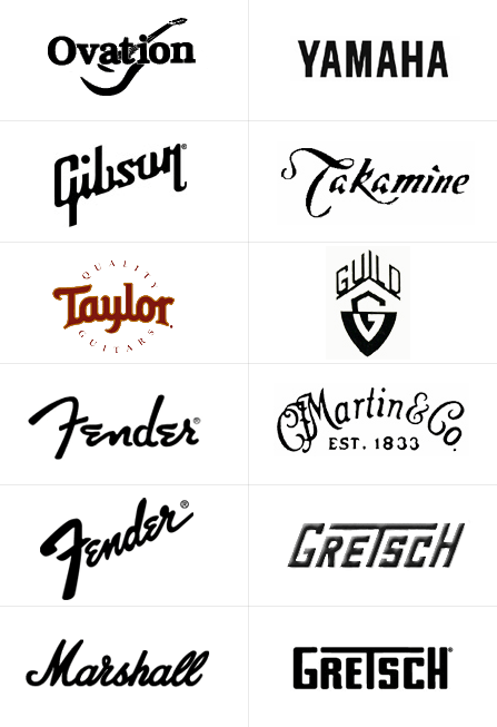
I’m sure you are familiar with some of the bigger brands however here’s a logo spread I made showing some of the players. I think I threw in a few amplifier companies, too.

Now the main thing I noticed in this case was that almost all of the logos are using a sort of handwriting font or a loose variant. I’m not a typography expert but I know all of these are similar enough to be gathered together here. What do you think?
18 responses to “Logo of the Month #3: Fender”
It’s not surprising so many of these are similar, because these companies are consolidated. Fender owns either Gretsch or Guild, and I think Ovation as well, and Gibson owns Epiphone (not pictured.)
Gibson actually has quite an interesting history, there’s a bit about their recent changes in branding in the new Martha Stewart book. Basically the quality of the company went seriously downhill and they have a new CEO changing things up a lot, and restoring their name.
Fender owns Gretsch AND Guild, but not Ovation.
It makes sense to have many of the logos appear like handwriting in order to emphasize the handmade qualities of the instruments. Yamaha is the least handmade and their logo shows.
I do the website for Lakland.com, a bass maker. Their name is a combination of the two founders – Dan LAKin and Hugh mcfarLAND. So many people pronounced the the name like Lackland that they quickly put a symbol over the first A to emphasize the pronunciation. Now it’s just part of the logo!
Ah, I knew I was close 😉 Doesn’t Martin also own another guitar maker?
Cool! I have been a brainfuel reader for a while now. Cool to see a topic that is close to me being I am a designer and a guitarist that has also done quite a few sites for musical manufactuers. I use to do ESP Guitars website (2004 was last year I did their site) and I did Schecter Guitars 2005 website http://www.schecterguitars.com which has remained pretty close to the original design sans a few bad image sizings in the news section and little things here and there that the client did after the site was turned over to them with admin access. Cool to see all the guitar topics here!
by the way – Fender also owns Tacoma.
Jason, thanks for being a visitor!! I like the sites you’ve done, especially your portfolio site. Cool stuff.
One thing about the Tacoma site that’s really weird is that they have the Holiday theme up already and it’s just November. I saw Santa at Wal-Mart last night so I can vouch for his existence.
Thanks Chris, I’ll be launching a new portfolio site sometime the end of this month hopefully! The current one is seriously out of date. I enjoy brainfuel alot!
Does any one know the font used or simmiler to Fender and Gibson ??????? Realy wanna know been look for ages can’t seem to find any trace if u find the font plz email me with the link
regards mitch
Does anybody have the font of the Fender logo? I need to make a tracing of a name, for a tatto, it’s like a honour for this great guitar brand.
Tnx!!!
I don’t think it’s a font. I think it was probably hand drawn.
Hi, Chris – Do you have a big, clean scan of the CFMartin logo that you could send me (like the big version of the Fender logo)? I want to paint it on the outside of my guitar’s road case – but I need a clean copy of it. Everything I can find on the web is fuzzy edged. DW
Sorry Dave, I don’t.
I like the requests for a clean large image. They want to make fake decalas but not have to put in any effort. No no its for a tattoo … LOL
The fender fonts are Brush regular and other variations of that and I dont have the font but thats what it is
I say it should be Gibson instead of Fender cause’, personally, I’m a big fan of Gibson.
I bought a Jazzmaster a while back with a schecter pickguard, controls and pickups. Do you know anything about this conversion? The pickups are sealed and appear about the size of a soap bar pickup. They are chromed and have no poles. I’ve never seen another conversion like this but it sounds great. The body and hardware are 61 but the neck is a bound 66 with rectangular position markers. Any help tracking this down would be greatly appreciated. I can’t quite believe I have the only one.
The Fender logo was hand drawn. It was designed by the 3 founders of the company, and to my knowledge… there isn’t a font that you can download from the net that matches the logo. But hey, things change every minute.
I have a ’53 Fender Stringmaster D8. This instrument logo is in bold capital letters. I can find no references to this deviation from the handwritten font. Any Info?
Murray