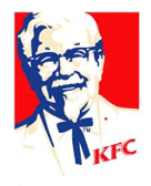
Before:

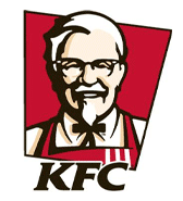
After:

Kentucky Fried Chicken introduces a new logo and new web site, all which are quite interesting. What do you think?
Discussed on Brand New.
Before:

After:

Kentucky Fried Chicken introduces a new logo and new web site, all which are quite interesting. What do you think?
Discussed on Brand New.
11 responses to “KFC introduces new logo”
I think it makes the colonel look 20 pounds lighter. This may have something to do with their new cooking oil.
Interesting that the really push ‘KFC’ everywhere now, then you get to the website and it’s good ‘ol ‘Kentucky Fried Chicken’.
I think it’s a refreshing, ‘finger-lickin’ good update of the timeless Colonel.
It’s interesting how he’s no longer tilted, as if he was missing a V8 fix or two.
I think this a great rework that works on many levels.
1. By merely changing the outline color, the Colonel looks healthier, because of the up in contrast.
2. The Colonel appears happier, healthier, in better shape and thinner all because his posture has been straightened
3. He appears more personable and approachable because of the 3d effect caused by the tilted background and the breaking of the boundary by his head
4. By adding the bib, he is transformed into one who serves where before the plantation “master” outfit made him appear as one who should be served.
Interesting effect, considering the logo didn’t really technically change all that much.
Whats up with the three stripes on the new apron or bib as some of you called it. The apron makes me think they have old people serving food there for minimum wage.
The plantation outfit as someone put it is a suit with a southern style tie and represents how the man dressed. This shows the man to be more regal and part of a tradition. As opposed to some server who asks if you want fries with that.
Anyway the new logo isn’t all that different except I have to say the primary blue and red colors looked a lot better IMHO than the maroon and black. The beige on both seems to not be all that noticed on either.
The blue and red also kind of made it seem patriotic, after all the Colonel’s story was the stereotypical American dream. Also I like the “Bucket” shaped background.
Looks like he joined the Weight Watchers or did KFC aquire WW?
How bout this KFC ad from space?
http://video.google.com/videoplay?docid=8731914636474352421
Mark, I totally agree with you about those 4 points.
A much better rendition. Th logo and website definitely is refreshing to say the least! The apron has a nice social touch too. However that new logo is yet to arrive in Singapore!
[…] Not just content with re branding the age old brand of KFC, the company have decided they are so proud of it that the world…and other worlds should see it. […]
More confident 4 everyone to eat there and its looks very attractive….like it give KFC a new face.wow….!