Would be a lot better if it was an actual leap year :rolleyes:
I’m all for it. I was always surprised at how ugly their website was for a large company. Bonus points for being HTML/CSS.
Stephan: That’s a really good point. Interesting.
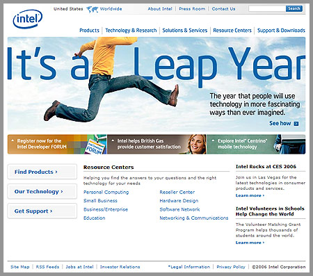
The homepage gives me a feeling that Intel doesn’t seem to be very interested in boosting their new logo. It’s rather tiny to me.
I was surprised and impressed when I saw the redesign. Not too edgy, but really nice. I have to disagree with Danny to some degree, though. Yeah, the logo is pretty scaled down. But, everything else there strikes me as something like “hey! did you see that we’ve re-branded?! *smack* hey! see? see? did you notice?! look! new type treatments! *smack smack smack*”
Or something. 🙂
I’m like a broken record on the logo design, but the site redesign is a big winner in my book.
I think it’s nice but I hate that type for “It’s a Leap Year” bleh.
Improvement from old one. I like the color choice oodles more.
I agree with Beth. I’m not keen on the type used on “It’s a Leap Year.”
7 responses to “Intel 2006”
Would be a lot better if it was an actual leap year :rolleyes:
I’m all for it. I was always surprised at how ugly their website was for a large company. Bonus points for being HTML/CSS.
Stephan: That’s a really good point. Interesting.
The homepage gives me a feeling that Intel doesn’t seem to be very interested in boosting their new logo. It’s rather tiny to me.
I was surprised and impressed when I saw the redesign. Not too edgy, but really nice. I have to disagree with Danny to some degree, though. Yeah, the logo is pretty scaled down. But, everything else there strikes me as something like “hey! did you see that we’ve re-branded?! *smack* hey! see? see? did you notice?! look! new type treatments! *smack smack smack*”
Or something. 🙂
I’m like a broken record on the logo design, but the site redesign is a big winner in my book.
I think it’s nice but I hate that type for “It’s a Leap Year” bleh.
Improvement from old one. I like the color choice oodles more.
I agree with Beth. I’m not keen on the type used on “It’s a Leap Year.”