I really enjoyed the design of the Icebreaker web site. They’ve done a great job with photography and generally building the brand.
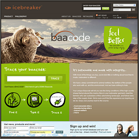
I really enjoyed the design of the Icebreaker web site. They’ve done a great job with photography and generally building the brand.
5 responses to “Icebreaker”
Amazing! This is what happens when you have vision and the tenacity to realize it.
Visually the site looks nice.
UI and well what the site is all about SELLING. BLOWS!
example:
it took me 6 clicks to find a product that i MIGHT want to purchase ONLY to be told it’s out of stock and to submit email to receive notice when in stock.
ARE YOU JOKING ME?
Would you walk into a store and go up to a sales clerk where to buy a shirt…only to be told to go into 6 different rooms and once you found what you wanted only to be told “SORRY LEAVE YOUR NUMBER AND WE WILL CONTACT YOU WHEN WE CAN SELL YOU THIS SHIRT!”
this site gets a thumbs up for it’s visual design and a thumbs down for a site that is useful to someone that might want to buy their product.
BLAH!
–TOM
also i might add…. as much as the photography is very nice it’s not using the space correctly. Having a large banner taken up with a photo with no copy and CTA (call to action ) to me is wasted space. but i agree the photography is nice looking.
Anyone know who designed and built it?
If anyone’s interested it’s a combination of Flightless and Inhouse here in NZ