2 responses to “I was struck by the simplicity of this site”
Beauty in simplicity is hard to find. Groups like Moment do it well. It’s definitely a balance between the actual message/idea/product being communicated, and execution of it.
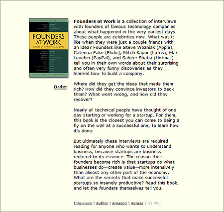
It looks good on the first page but… If it was at the top it would be more obvious that there are other pages. On the second page, it’s hidden since that page is so long. And then 2 of the links keep you in the site while the other 2 take you to other websites (something that is not obvious and somewhat surprising). The ways in which it is unique is also what makes it not work as well. Sorry to be a downer. The book looks interesting though. 🙂
2 responses to “I was struck by the simplicity of this site”
Beauty in simplicity is hard to find. Groups like Moment do it well. It’s definitely a balance between the actual message/idea/product being communicated, and execution of it.
It looks good on the first page but… If it was at the top it would be more obvious that there are other pages. On the second page, it’s hidden since that page is so long. And then 2 of the links keep you in the site while the other 2 take you to other websites (something that is not obvious and somewhat surprising). The ways in which it is unique is also what makes it not work as well. Sorry to be a downer. The book looks interesting though. 🙂