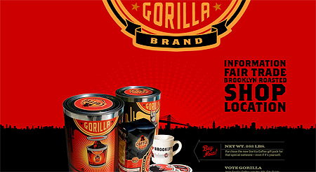
Ok folks, the Gorilla Brand web site wins all of the awards for April, May, and June as the coolest site I’ve seen in quite a long time. The layout and animations remind me just a little bit of the old Dominey Design site. What makes this site awesome? Well the very strong branding (this is what branding is folks) and use of color. The red and black theme with touches of yellow really stand out here.
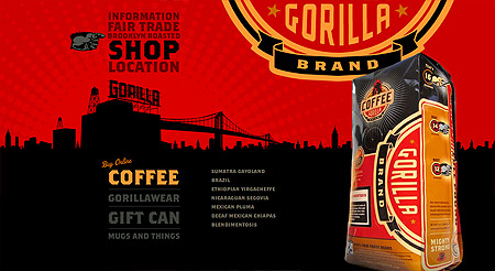
The main thing to imagine is that this company hired a designer somewhere who looked at this project and said “wow, we could do this” — and you know what, somehow this client really gets it because it’s obvious they didn’t reject design ideas. Because it’s beautiful. Imagine if they had been hard to work with and they had only gotten a simple 5 page HTML site built with frames? No gorilla theme and no use of reds and black. No animation. This web site transformed this company — no doubt about it. Let this be a lesson to all of the impossible clients who don’t trust their design firms. You’ll never get anything like this unless you’re easy to work with.
2 responses to “Gorilla Brand Coffee”
Great find! I love the map section. They’ve taken a page that’s typically bland and transformed it into something fun to look at. They even added a little King Kong inuendo to boot.
I wonder though. I’m not an accessibility zealot but if they have a hidden flash detection why don’t they have a link to static site? Aside from the page transitions not much would have to go.
I know! That map is really cool.