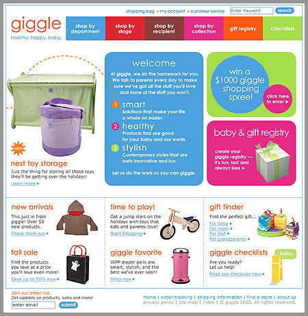
Giggle is the sort of site I look at and say “nice colors but too much for me.” However, I still decided to post it here because I felt the execution was very well done. Someone sent it to me and wanted me to look at it because of a proposal for a similar site. Honestly, it’s a little bit too-clean, you know? I’d like to see the small business, personality aspect shine through a little bit more. Where’s the life in this site? Anyways, there you go.
6 responses to “Giggle”
Yikes, have you looked at the code? It’s got about 149 nested tables. I don’t think we should be promoting this kind of stuff as an example. No matter how well executed the design is, it’s got to be built well.
Yeah, I agree. But the design is what I posted it for, not the code.
Personally, i love the design. I think its original, and themed appropriately.
The site really has got a kinder surprise / lego blocks feel about it and I feel it reflects very well on the products and the target market.
Sure the code is bad, but the design is gooood! (except the menu, which is AWFULL – in Firefox anyway).
I love it, its all based on my opinion but I think its a winner.
I don’t think the design is really all that original, it kind of looks like it should be for a Target or Kmart sub-page. I agree, they haven’t added that small business touch. In spite of all the colors it still seems kind of cold to me.
The design is nice and clean but oh the code. It does rather remind me of something like Zellers or Kmart. I wonder how many visitors they get from having Google mis-typed?
I agree with the too-clean feeling about it. It looks almost templatey — it could be a site about anything.