GE has introduced a revised logo and web site. The most stunning aspect of this new home page is that they’ve highlighted a single business and added a nice graphical element with headline. Its bigger than even the logo! I think this is a very cool use of the header and wouldn’t be surprised to see similar ideas pop up in sites over the summer.
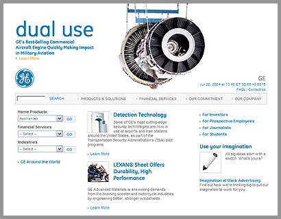
At the same time the new brand web site is cool to see. I won’t go in to specifics about the branding and logo modifications except to say the most significant element appears to be they’ve chosen a unique color for each GE company. That’s a neat idea. David Weinberger posted at Speak Up and has provided excellent analysis about this very topic. So go there for details.

Don’t miss downloading the new GE Inspira logo (brand new).
One response to “General Electric’s new branding”
yeah i love it, gets a bit bare when you get to content (they should do something about that) but altogether nice… the use of big banner graphics above logos is nothing new… ive seen it all before – but it IS niceley implimented.
Mark