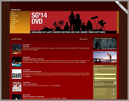
Very clean. I like the way how handle the navigation and cross out the page that you’re currently on. I’ve never seen a site do that before.
The only thing that bugs me is the width of the layout. In a resolution lower than 1024×768 you have to scroll. And honestly, they just don’t seem to have enough content to fill up all that space so it ends up looking kinda sparse sometimes.
nah, they should have used a local web design firm for it (hint we’re in Brighouse)
Tom: yeah, I totally agree. I want to use unorthodox navigation schemes in a design now. Hehe.
Mark: So do you know who did the site?
I don’t really know what the site is about after quickly scanning the front page.
4 responses to “Embrace UK”
Very clean. I like the way how handle the navigation and cross out the page that you’re currently on. I’ve never seen a site do that before.
The only thing that bugs me is the width of the layout. In a resolution lower than 1024×768 you have to scroll. And honestly, they just don’t seem to have enough content to fill up all that space so it ends up looking kinda sparse sometimes.
nah, they should have used a local web design firm for it (hint we’re in Brighouse)
Tom: yeah, I totally agree. I want to use unorthodox navigation schemes in a design now. Hehe.
Mark: So do you know who did the site?
I don’t really know what the site is about after quickly scanning the front page.