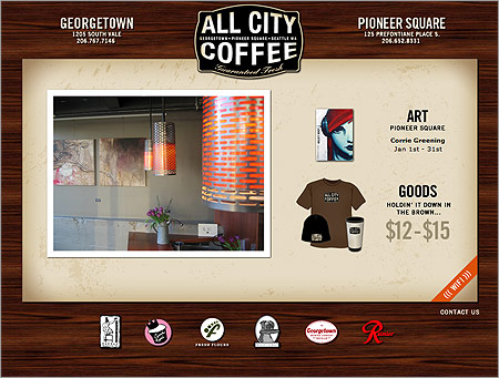
I think the navigation on the All City Coffee site is a little bit different: it’s just icons at the bottom of the page. The clean logo and fanciful wood background suggest I’ll see wood floors at the coffee shop. Good stuff.
I think the navigation on the All City Coffee site is a little bit different: it’s just icons at the bottom of the page. The clean logo and fanciful wood background suggest I’ll see wood floors at the coffee shop. Good stuff.
3 responses to “Drink All City Coffee”
Yeah, it looks nice but I still think it falls under the category of “mystery meat navigation.” I hate having to look in my browser bar to see where I’m going to go when I click somewhere. Even just one word below each picture would be great! Maybe this is just my pet peeve though…
I agree with you there. It’s almost as if the site was designed in a rush and came out great but lacked those usability details.
Having been to both shops, I would say that the site does a good job of reflecting the “cool” of both places. I love the photos on the front splash page and the clean navigation. I also like that when I click on an icon, I get exactly what I expected from it. BTW – they serve a great cup of coffee too (and free wifi!)