Dang, how do people come up with such amazing sites like Cogmap? It’s stunning, really. I bet they could create multiple versions of this site, for the variety of things humans chart (web sites, sewer systems, governments, etc.).

One thing I noticed about their homepage is that they have used subdued colors, even eschewing Web 2.0. I like it! It’s fresh, and speaks to its purpose: mapping corporations.
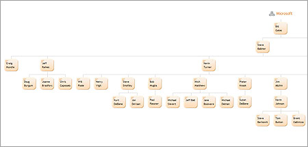
Here’s what the company chart looks like for Microsoft.
One response to “Cogmap lets you map corporate structures like a wiki”
How about a family tree? Has anyone come up with a nice way of creating and displaying such a thing online like Cogmap does?