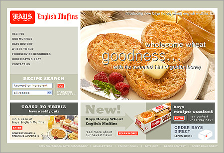
Once again, excellent photography and a super interesting site layout (but not complex) wins. Check out the Bays English Muffins site.
Once again, excellent photography and a super interesting site layout (but not complex) wins. Check out the Bays English Muffins site.
One response to “Bays English Muffins”
Nice! That’s a good example of what can be done with some decent typography in the graphic elements and a restrained color palette. Those slab serifs and the color choices work really well with their super old school black letter logo (which I’ve always admired) to make a nice contemporary design with a little retro flava.