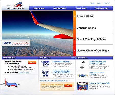
I just heard from a friend who told me that Southwest Airlines has redesigned their web site. I think it’s a rather interesting layout choice they have made. First of all, those magnificently huge buttons are, well, huge. I like them on initial visit but wonder if they’re too-big.
Hat tip: The Closet Entrepreneur.
7 responses to “A Southwest Redesign”
It is unfortunate that Southwest didn’t carry over the look and feel into the second level of their site. The rest of the site seems very odd looking after viewing the home page.
Steve, you make a good point, I too noticed that the rest of the site remains similar to the original design. Maybe it’s a “staggered” redesign. 🙂
Bigger is better or so the ladies tell me….lol.
Actually since their target audience runs the entire gamut and it looks like it is easier for people to find what they need on the front page. You have to remenber older peoples vision and their unfamiliarty with the internet in general, you do not want to make it too hard for them to find what they need.
I don’t know if I like those ginormous buttons myself. They are handy to jump any of the major site functions but they are way too similar at a quick glance. Maybe the orange to red gradient is supposed to setup the hierarchy of importance? I am not neccessarily an icon advocate for every cause but it might make it easier to differentiate.
No one noticed that when you click on one of the “giant buttons” that the site gets all ajaxy and you can perform some of the most common functions without ever suffering a page reload? It think its genius.
Ian, that Ajax stuff is new, it wasn’t there when it first launched. I like it!
This kind of smells like a templatemonster template. Not in a bad way per say, but not so much in a good way either.