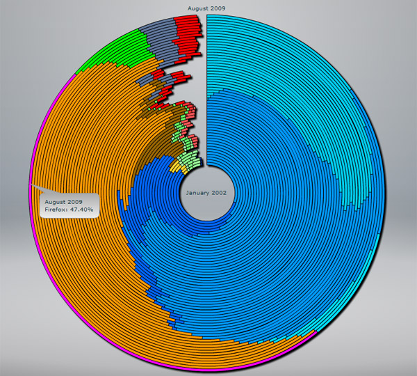
An excellent visualization method for displaying web browser popularity over time. Saw this over on Hacker News.
It’s not the best way to show data, but it’s new and interesting.
An excellent visualization method for displaying web browser popularity over time. Saw this over on Hacker News.
It’s not the best way to show data, but it’s new and interesting.
One response to “Web Browser Market Share in Tree Ring Format”
wow! is this data accurate, or was it arranged to look like firefox logo?