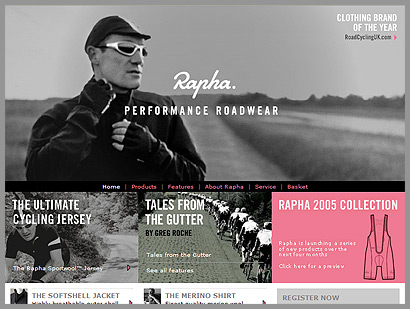
The first thing I liked about the Rapha site was the huge headline image on the home page (the concept is followed throughout the site). Then the sweet logotype treatment. I really love fonts like that. I fall for them all the time. I’m interested in someday having a product or company with a logotype like that.
I’m not entirely sure where the pink color fits in, although if anything, it matches with the grayscale tone of the site. Maybe pink is their color.