I was checking out the Engadget blog and liked some of the ways they have the site designed. I’ve included a few screen captures below, of the areas I liked the most.

Interesting way of showing which posts are the most popular.
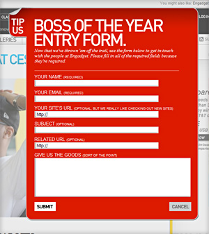
When you click “Submit Tip” this panel pops up with the giant headline “Boss of the year entry form,” and right under that in small type it says “Now that we’ve thrown ’em off the trail.” — cool idea!

I liked the search input field design for the way they graphically made it feel important.

Sections are separated with this fantastic divider which shows the number of comments, and lets the user share or get a link.

The calendar showing the number of posts by day, which I find is often useless, looks awesome on this page layout. When you hover over a specific day you get a pop out that shows the number of posts.
So that’s just a few of the things I liked about the current Engadget site design.