13 responses to “What would happen if google re-designed their site?”
Haha, I was just looking at that myself.
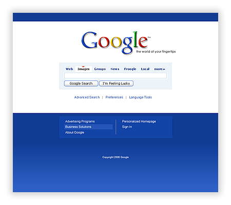
I think some things are good here but this would receive a broader appeal if the tagline were dropped. Google doesn’t need one. I also think the blue gradient backgrounds need to go and then maybe drop that box around the search area. Otherwise it’s cool.
I think anything is a large improvement.
I agree, the tagline is a little strange since ‘Google’ pretty much is the tagline. As far as aesthetics are concerned, unless a facelift can bring in a million more users, no one at Google is going to care.
Oh yeah, their crappy interface has totally been hurting business!! That new blue bar at the bottom will no doubt give me better search results and a fuller head of hair!
Want my opinion? Somebody’s got a little too much time on their hands. And digg, etc are just about ripe for the self-advertiser’s picking… This is less of a comment on design than a ploy for a web-hit spike and 15 minutes of fame.
I think it’s a fun exercise, no doubt. I like the cleaner search box, but I think the triangle above the tabs might be a little too much. The gradient at the bottom is a nice touch, but if you think of it from a logistics standpoint, the gradient is probably around 5 kilobytes, multiply that by, oh I dunno, 10 million downloads per day (50 million kilobytes is roughly 47 gigabytes) and you’ve just added 47 gigabytes of traffic onto Google’s servers per day all for a gradient at the bottom 😉
I think the site loses alot of it’s identity with all the blue. Google as since the beginning branded itself nearly equally on all four colors and moving so much focus over on the blue color kinda throws that branding process and recognition away.
Andy Rutledge, andyrutledge.com Via Brainfuel…
…
Oh well. I thought it looked good anyways.
I liked the guy’s comment about how it’s easy to overlook the flaws in something simple. But when something is complex (like ebay) the flaws are really glaring. Which is part of why google has gotten away with having such a ghastly logo and amateur looking web site for so long.
I like the eBay one. I remember hearing a few years back about how eBay had a new layout ready to roll and then they had some server outages and it was scrapped.
This all reminds me of what 37signals used to do before they became too cool for the popular kids to associate with. Remember they redesigned FedEx and a couple others? Those were the days.
nice!
The ebay one is super sweet – now there is a site that needed some org to it! This andy guy has some good design thoughts.
I’m all for improvements to interfaces and making things visually appealing.
Jason – Tom and I had a whole discussion about this today and we basically agree with the way the E Bay site looks in his concept but he definately would have to add more of the browse capabilities — like the Categories. Otherwise it’s awesome.
13 responses to “What would happen if google re-designed their site?”
Haha, I was just looking at that myself.
I think some things are good here but this would receive a broader appeal if the tagline were dropped. Google doesn’t need one. I also think the blue gradient backgrounds need to go and then maybe drop that box around the search area. Otherwise it’s cool.
I think anything is a large improvement.
I agree, the tagline is a little strange since ‘Google’ pretty much is the tagline. As far as aesthetics are concerned, unless a facelift can bring in a million more users, no one at Google is going to care.
Oh yeah, their crappy interface has totally been hurting business!! That new blue bar at the bottom will no doubt give me better search results and a fuller head of hair!
Want my opinion? Somebody’s got a little too much time on their hands. And digg, etc are just about ripe for the self-advertiser’s picking… This is less of a comment on design than a ploy for a web-hit spike and 15 minutes of fame.
I think it’s a fun exercise, no doubt. I like the cleaner search box, but I think the triangle above the tabs might be a little too much. The gradient at the bottom is a nice touch, but if you think of it from a logistics standpoint, the gradient is probably around 5 kilobytes, multiply that by, oh I dunno, 10 million downloads per day (50 million kilobytes is roughly 47 gigabytes) and you’ve just added 47 gigabytes of traffic onto Google’s servers per day all for a gradient at the bottom 😉
I think the site loses alot of it’s identity with all the blue. Google as since the beginning branded itself nearly equally on all four colors and moving so much focus over on the blue color kinda throws that branding process and recognition away.
Andy Rutledge, andyrutledge.com Via Brainfuel…
…
Oh well. I thought it looked good anyways.
I liked the guy’s comment about how it’s easy to overlook the flaws in something simple. But when something is complex (like ebay) the flaws are really glaring. Which is part of why google has gotten away with having such a ghastly logo and amateur looking web site for so long.
I like Andy’s eBay redesign too: http://www.andyrutledge.com/ebay_redux.php
I like the eBay one. I remember hearing a few years back about how eBay had a new layout ready to roll and then they had some server outages and it was scrapped.
This all reminds me of what 37signals used to do before they became too cool for the popular kids to associate with. Remember they redesigned FedEx and a couple others? Those were the days.
nice!
The ebay one is super sweet – now there is a site that needed some org to it! This andy guy has some good design thoughts.
I’m all for improvements to interfaces and making things visually appealing.
Jason – Tom and I had a whole discussion about this today and we basically agree with the way the E Bay site looks in his concept but he definately would have to add more of the browse capabilities — like the Categories. Otherwise it’s awesome.