I found Traineo today after I read a brief synopsis at Solution Watch. Overall it is a beautiful interface and offers a great number of improvements over the traditional user administration system. Check out the User Profile page and be amazed. It’s amazing.

The homepage.
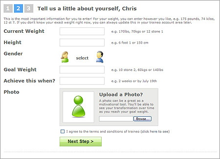
One of the sign up forms. The entire process utilizes Ajax (so it’s one page) and works amazingly well.
11 responses to “Traineo”
You know, I have to say that I look at this site and NOTHING about it other than the intro verbage says “fitness site”. It could be any one of 50 “Web 2.0” sites.
The Web 2.0 “look” is getting *old*, folks. Just because it’s clean and shiny doesn’t mean it’s good communication design. This site says “design-on-rails-paint-by-numbers”, not fitness, or training, or weightloss, or whatever.
Can you point out a site that doesn’t do this?
Hi,
Steve — I agree; this does look like just another 37S clone, but I don’t think it’s so much “bad design” as it is very weak branding, which is the problem I find with most “Web 2.0″ stylized sites.
Overall, everything is crisp, clean and very well presented, as it should be with any good design. I instantly picked up on the purpose of the site and the quick run down of features and the screen shots gave me a good overview of what to expect after signing up. Like you, though, I just don’t get the “fitness” bug when I look at the presentation as a whole.
That’s an insightful comment, Mike. I think that’s it. A lack of branding.
Yeah, Mike nailed it. Too many of these new sites lack a distinct, memorable brand. Especially as product and site names are getting harder to make unique, the names get less memorable as the same phonemes are recombined over and over, the visual brand needs to take up the slack.
But really, the brand isn’t fitness — it’s about communication and community, just like most of the 2.0 sites out there.
I too am growing tired of the look, but for now it’s fitting the trend, and hence is following the distinct and memorable brand that is the web me too — oh! GUI.
Mark,
To say the brand is about community is a copout – most any forum-style website is about community and communication. I firmly believe that sites can have all the shiny and ajax they want, but without a proper brand and a proper identity, they’re going to get lost in the noise.
A copout? How so?
All I’m doing is arguing that the brand design is misdirected. You noted this yourself in the first comment when you mentioned “web 2.0.” The site is branded, and successfully so, as web 2.0. Therefore it’s not a weak brand — but rather a misdirected brand.
For example: It’s painfully obvious that this is a site designed to serve as a Basecamp for the dieting niche — and it will probably serve that need / audience well.
Mark,
I should not have used the word copout, since it’s needlessly antagonistic. Sorry about that.
What I was trying to say was that defending the “brand” by saying it’s about communication and community doesn’t mean anything to me. So many sites are about community or communication. Traineo’s “brand” is (or should be) about fitness, accountability, and encouragement. I see those three concepts as the thing that makes the site interesting and useful, and the design (in my mind) should be focusing on indentifying those to the user and reinforcing them in the user’s mind.
When I saw that Traineo.com was coming out with a Web 2.0 Weight Loss application I was like hmmm…, I’m for weight loss and I’m for Web 2.0 so I figured why not.
I’ve only seen one problem
Um….Traineo isn’t anonymous! If I wanted to see that Jane wants to lose 40lbs it’s pretty easy to see that Jane wants to lose 40 lbs, I just go to her profile.
I did a 3 week review on my blog webpodge.com as well.
http://www.gimme20.com (shameless plug) is a similar site which offers more security for those who want to keep their information secret (and share with specific people). Worth a click.