Yesterday Air France had an airplane crash (in which nobody died so that’s good) and since they’re in the news let’s rip apart their web site just for fun.
Good? Bad? Effecient use of space or crammed like your legs in coach? I like the logo.
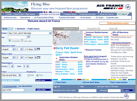
Yesterday Air France had an airplane crash (in which nobody died so that’s good) and since they’re in the news let’s rip apart their web site just for fun.
Good? Bad? Effecient use of space or crammed like your legs in coach? I like the logo.
7 responses to “Since they were in the news”
They really have tried to fit too much information into too little space. There’s also weird layout issues here and there. Like on the footer where you can sign in. There’s no left margin inside the table and the alignment of things is just funky.
I’m am avid fan of margins/padding. I hate when text goes up flush against other things.
Those are some good comments.
It makes my head hurt
I agree with Tommy. Even if you are using tables, padding is still a really good idea…
isn’t this typical of too many corporate sites – lets get all the info on the front page.
I agree with you guys, margins and padding go a long way to add to the visual appeal of a site. Having said that, the colour scheme is easy on the eye, and there are far worse out there.
As far as commerical airline sites, I’m a huge fan of the Air Canada, Aeroplan site.
https://www.aeroplan.com/en/home/index.jsp
Great use of white space, colour scheme and artwork.
Closer to home for us Air New Zealand, seems to stack up alright, http://www.airnz.co.nz/, if not a little broing, with out that french jenec’est quoi!
While we are on sites, I’ve gotta have a brag about our main govt New Zealand tourism site, http://www.newzealand.com/travel/
I think it is fantastic, but I’d love to know your thoughs.
yeah…I have to say that the Air France site looks like one of those sites that started out with a beautiful layout and ended up having 3 tiimes the content it for which it was designed stuffed into it.
arg! Today, there’s an image that’s completely smashed into the space in the center of the page. yikes. :^)