It’s fascinating to watch these candidates position themselves. Both in the media and with their web sites. It’s also fun to watch them craft a visual image. Some have really good teams behind their identities, and others only so-so.
I’ll point out that Gilmore and Hunter have failed the apostrophe test. It only works one way, guys.
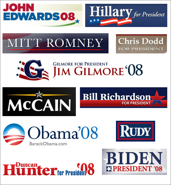
Here are my votes for strongest logo: Hillary (because of the bold typeface, and clean and unique flag) and John McCain (for bringing in the military theme). I like Rudy’s logo, but wonder if it should say something else?
My friend Gary sent me a really neat link today. One of the people involved with Wesley Clark’s campaign posted a few of the concepts they came up with and the story behind the logo. Great reading.
19 responses to “Presidential Campaign Logos”
I know Obama’s going for the ‘new day over the American heartland’ look, but it comes off as more ‘whole grain cereal’ to me
I’ll say too that I like McCain’s and Edwards’, because their logos tend to communicate an idea — McCain’s = military and Edwards’ = environment
Likewise, Gilmore’s tends to have a very strong association with the Freemasons
My first thought of Rudy’s is that he’s playing off the movie by the same name. When I look at his logo all I can hear is a Notre Dame chant — Rudy…Rudy…Rudy
I know these are presidential hopefulls’ logos, but as far as political candidates in general, the best I’ve ever seen is the one for Jim Esch (http://www.jimesch.org/). I love how they tied the “J” and the “E” in to form a flag.
Based on this analysis from before ( http://www.nytimes.com/imagepages/2004/10/08/opinion/20041009_opart2.html ) it seems Hillary, John Edwards, and McCain have the best chance.
Good stuff everybody. I like the Jim Esch logo. That’s certainly unique and something that would be recognizable.
I think the Bush and Kerry identity analysis is spot on.
I like Barack’s, only guy smart enough to include his URL
I like Obama’s also, but agree with others, that it does not seem to be presidential in design.
Mitt Romney’s design seems forboding like the Sith Lords will take over America once he’s elected.
Although I don’t see myself voting for Hillary, I must concur that her design is truly the best in regards to what the logo is supposed to convey.
Jim Esch (congress) has a great campaign logo, designed by Archival. I found it on Inkblot Robot Blog, but you can also see it at http://www.jimesch.org.
-Ellie (www.flywheeldesign.com)
oops, sorry about that. Didn’t realize someone had already posted about Jim Esch’s logo.
[…] Chris Tingom over at BrainFuel did a nice writeup about presidential campaign logos. He’s also posted some of the better ones out there, check it out. My favorite logo is McCain’s because of it’s uniqueness and military flavor, but Hilary Clinton’s logo isn’t far behind. […]
Wow, that Jum Esch has a killer website too. Now that’s what a presidential site should look like — clear, concise to the point and classy without a lot of fluff getting in the way.
Obama’s looks very Web 2.0’ish. I’m a bit disappointed his designer didn’t go for Helvetica Rounded and a reflection. Personally, I like “Rudy”, if for no other reason than it seems the least cliché. But, yes, it’s very reminiscent of the movie.
[…] Presidential Campaign Logos – i like Barack’s! he included his url, smart man […]
McCain’s logo looks far too similar to the food company logo for my liking.
http://en.wikipedia.org/wiki/McCain_Foods
Aside from being the same name, they also use the same colours (white text on black rectangle with yellow highlights) and both feature a ‘star’.
“Military” certainly wasn’t the first thing that came to my mind.. more like “mmmm.. oven chips!” (or french-fries to you guys, I guess).
[…] Atrocious Apostrophe’s Pool: poor use of apostrophes abound. Also, look at Gilmore and Hunter’s campaign logos for more apostrophe badness. […]
great read. i set up a website for everyone to vote on which logo they think is best. check it out:
election08logos.blogspot.com
I am helping with a local district attorney campaign logo- finding someone to do it that is- Anyone have any recommendations?
And what about color – what happens when you stray away from the tradition red, white and blue- I like McCain’s, choice of colors- or lack there of.
I was also wondering about the “green” thing- that is so popular these days- like the way Edwards hints at that aspect. Even though this election has nothing to do with the enviorment- it’s judicial, but what the heck better than prison stripes!
Pam
Hillary’s is good, but on a round button it looks strangely like a pillsbury logo or something.
In general, I find you do better with your name being as easily read as possible. If you get a catchy logo that sticks in people’s minds (Bush’s “W” or potentially Obama’s O logo) that can be fine.
Trick is to decide — if you’r pushin name ID, make sure the name is big. If you’re established, and have an identifiable logo, you can go with that — otherwise make your name big and avoid clutter…
Extreme sex toys….
Extreme hard sex. Extreme pain sex. Eye extreme sex toys. Extreme sex pictures. Whore abuse the most extreme sex acts. Extreme animal sex. Extreme oral sex….