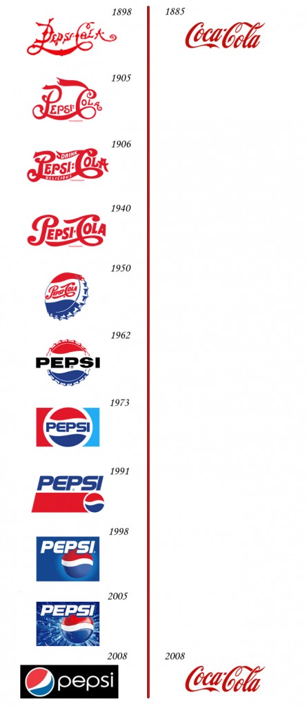
Very interesting image showing the logo redesigns between Pepsi and Coca-Cola.
(via Digg)
(By the way, the latest Pepsi logo reminds me of this every time I see it…)
Update: Apparently there were more, a lot more. – Chris
Very interesting image showing the logo redesigns between Pepsi and Coca-Cola.
(via Digg)
(By the way, the latest Pepsi logo reminds me of this every time I see it…)
Update: Apparently there were more, a lot more. – Chris
12 responses to “Pepsi vs. Coca-Cola Logo Evolution”
That’s really interesting. BTW, I found this variation made apparently at some early point: http://www.logoblog.org/coca_cola_logo.php
Haha.. Very interesting.
Well presented…you can see that papsi has being playing catch-up to coca-cola since day one.
that’s exactly why they call it “classic”… Branding done right.
I like the Pepsi progression. It changes slowly. The new design always has a bit from the one before it. It’s all connected. it’s cool. It works for me.
I was not aware of that. Impressive that such an old logo can be used until today.
It’s truly amazing how the Coke logo can stay the same over such a long period of time. And I love the changes Pepsi has made over the same time. Apart from what I prefer in the beverages, I love seeing this. Thanks for sharing.
it must suck for pepsi to continuously update their stationary and building signage EVERY TIME….. what a waste.
The 2005 Pepsi logo is the best! Pepsi is my favorite beverage of all time!
http://www.underconsideration.com/brandnew/archives/coca-cola_vs_pepsi_revised_edition.php
look this is wrong
The first logo of Coke came out in 1986 and was different from the one you posted, you should research more before posting something that instead of inform and help people, ends dumbing down those who read your publication.
This is a lie. Coca Cola has had as many designs if not more than Pepsi. This graphic incorrectly identifies the first logo as the current logo. The first logo in fact was in roman style letters, and not the stylized logo we see today.