Hey, I like that. I worked for the Days Inn while in college
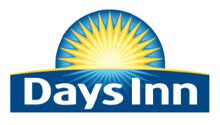
Something seems a bit off to me with the type proportions, but overall a vast improvement.
Makes me think of Dole Bananas, but it’s nice. One of the few logo comparisons I’ve seen you do where it’s an improvement.
Yeah the space around the text looks odd. Possibly could have kept the caps. I like the update though.
I’d say it’s “web 2.0”, but they kept the vowels.
Now that’s a redesign. Definitely an improvement in my opinion. I agree that the space around the text looks a little cramped, especially on top – the text wants to breath a bit better, I think. But I like the typeface. It feels softer and more approachable, not quite as formal as the caps, and I think people are looking for that in a hotel these days.
Branding: Extreme Makeover Logo Edition For Days Inn…
Days Inn has a new logo. The change is not earth shattering, but it does come as a culmination of a “three year renaissance” for the brand name which has been looking to solidify its position as the low cost hotel of choice. Bill Geist, in his March 1s…
I like it in general, but it looks like they should have stopped earlier on in the design process. I’d like it a little more simplified, personally.
Also I once stayed at a Days Inn in Roswell. It smelled like a hobo had vomited up urine, so good luck with that positioning guys.
Both of them are ugly.
It makes me think of produce as well, think it is the sun horizon effect that does it.
I like the old one better. It was strong, sturdy, trustworthy. When you stay in a hotel, you want to feel safe. It doesn’t matter if they are “cool” or with it. The old logo provided a stronger sense of security. The new one is pretty, though.
I don’t see that is an upgrade, it is kind of holidays program logo, it is not worth it to spend any money on that stupied look, the old logo is still more powerfull.
I agree the old logo is stronger, but updating is a good thing. I think they are going for a more soft, urban and modern feel. If so, this works. I do think there is a bit too much detail for a logo though…simplicity always prevails!
To the hobo comment: I work at a Days Inn and one of the challenges we have is pricing ourselves out of the hobo class and into normal people class–of course normal people that come in also complain that we don’t offer service on hand and foot like holiday inn and the rest–but just saying its hard to find a happy medium–but with the new brand revamp guests should feel more like they’re at a holiday inn express (ex: 4 pillows per bed, coffee maker, etc) with a slight bump up in prices. We Love it should help keep hobos out!
Definitely a smart and more vibrant look. It has a richness of texture that will play well in new materials and online. Who did this?
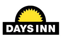
I am very sad to see the old logo go. Ever since I was a child my favorite motel chain was always Days inn. Their old logo always stood out to me as I drive down the highway as a place where you can get a great night’s sleep, a good breakfast, and a great rate. I am usually one for straight foward simplicity and that was what their old logo represented. It also tyed in well with their suburst rating system. This is another case of a logo change gone wrong, just like the comfort inn a few years ago. I doubt it will draw more attention to their motels and if anything they will not stand out from the crowd as well. If I could have given them advice I would have recommended they keep the old logo and instead focus on renvoating their older locations to give the chain a good reputation. I can only hope that perhaps in a few years they will look back and say to themselves, you know, maybe that was a bad idea, let’s go back to the old one. It’s probably wishful thinking on my part, but you never know.
In only minutes you can
Yes, You Can
[…] Oh, and to top it off: last week, while driving past those two hotels, I noticed that Days Inn has recently changed their logo as well. Is it good? It definitely looks contemporary with clean lines and gradients, but it kind of reminds me of canned fruit and the typeface will be out of style by the time you finish reading this blog. However, it’s definitely, hands-down, an improvement over the old 70s throwback. Well-played, Days Inn. […]
The old logo is clear and robust and also looks like an old company. The new one is more modern and I think it looks better. None of them are really good though…
You should really work on clean room, better customer service, & honesty from your hotel managers & customer service people before you worry about your logo.
21 responses to “Days Inn: New Logo”
Hey, I like that. I worked for the Days Inn while in college
Something seems a bit off to me with the type proportions, but overall a vast improvement.
Makes me think of Dole Bananas, but it’s nice. One of the few logo comparisons I’ve seen you do where it’s an improvement.
Yeah the space around the text looks odd. Possibly could have kept the caps. I like the update though.
I’d say it’s “web 2.0”, but they kept the vowels.
Now that’s a redesign. Definitely an improvement in my opinion. I agree that the space around the text looks a little cramped, especially on top – the text wants to breath a bit better, I think. But I like the typeface. It feels softer and more approachable, not quite as formal as the caps, and I think people are looking for that in a hotel these days.
Branding: Extreme Makeover Logo Edition For Days Inn…
Days Inn has a new logo. The change is not earth shattering, but it does come as a culmination of a “three year renaissance” for the brand name which has been looking to solidify its position as the low cost hotel of choice. Bill Geist, in his March 1s…
I like it in general, but it looks like they should have stopped earlier on in the design process. I’d like it a little more simplified, personally.
Also I once stayed at a Days Inn in Roswell. It smelled like a hobo had vomited up urine, so good luck with that positioning guys.
Both of them are ugly.
It makes me think of produce as well, think it is the sun horizon effect that does it.
I like the old one better. It was strong, sturdy, trustworthy. When you stay in a hotel, you want to feel safe. It doesn’t matter if they are “cool” or with it. The old logo provided a stronger sense of security. The new one is pretty, though.
I don’t see that is an upgrade, it is kind of holidays program logo, it is not worth it to spend any money on that stupied look, the old logo is still more powerfull.
I agree the old logo is stronger, but updating is a good thing. I think they are going for a more soft, urban and modern feel. If so, this works. I do think there is a bit too much detail for a logo though…simplicity always prevails!
To the hobo comment: I work at a Days Inn and one of the challenges we have is pricing ourselves out of the hobo class and into normal people class–of course normal people that come in also complain that we don’t offer service on hand and foot like holiday inn and the rest–but just saying its hard to find a happy medium–but with the new brand revamp guests should feel more like they’re at a holiday inn express (ex: 4 pillows per bed, coffee maker, etc) with a slight bump up in prices. We Love it should help keep hobos out!
Definitely a smart and more vibrant look. It has a richness of texture that will play well in new materials and online. Who did this?
I am very sad to see the old logo go. Ever since I was a child my favorite motel chain was always Days inn. Their old logo always stood out to me as I drive down the highway as a place where you can get a great night’s sleep, a good breakfast, and a great rate. I am usually one for straight foward simplicity and that was what their old logo represented. It also tyed in well with their suburst rating system. This is another case of a logo change gone wrong, just like the comfort inn a few years ago. I doubt it will draw more attention to their motels and if anything they will not stand out from the crowd as well. If I could have given them advice I would have recommended they keep the old logo and instead focus on renvoating their older locations to give the chain a good reputation. I can only hope that perhaps in a few years they will look back and say to themselves, you know, maybe that was a bad idea, let’s go back to the old one. It’s probably wishful thinking on my part, but you never know.
In only minutes you can
Yes, You Can
[…] Oh, and to top it off: last week, while driving past those two hotels, I noticed that Days Inn has recently changed their logo as well. Is it good? It definitely looks contemporary with clean lines and gradients, but it kind of reminds me of canned fruit and the typeface will be out of style by the time you finish reading this blog. However, it’s definitely, hands-down, an improvement over the old 70s throwback. Well-played, Days Inn. […]
The old logo is clear and robust and also looks like an old company. The new one is more modern and I think it looks better. None of them are really good though…
You should really work on clean room, better customer service, & honesty from your hotel managers & customer service people before you worry about your logo.